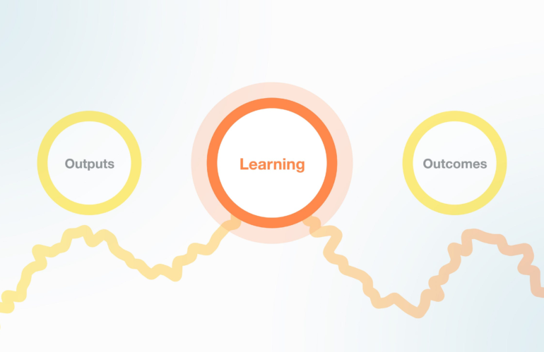
Creating the products and services we always wanted to build was never about changing the definition. Continue reading on UX Collective » Daniel Kahneman and the feeling of being caught Daniel Kahneman I like a good reframe. Don’t you? It used to be that saying “I don’t know” felt like honesty. Why does it now feel like …
Year: 2026
What happened to the car designed for women, by women?
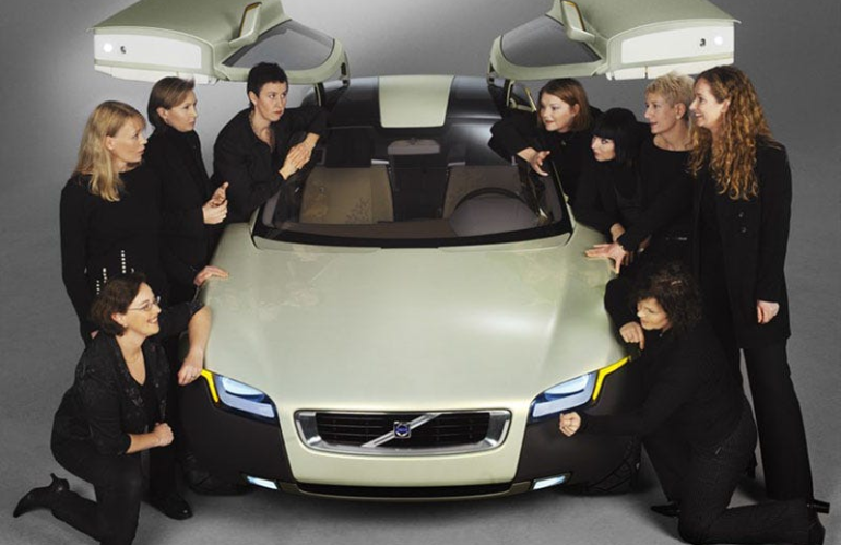
Lessons learned from the Volvo YCC and feminized crash test dummies Continue reading on UX Collective » Should product design teams be 100% creative, effective, or a middle ground between both? How do you know a product design is succeeding? What is our actual reality in business? These questions, and many more, are part of …
Things that don’t matter when you write

Extensive experience and “new” ideas are among them. Continue reading on UX Collective » Uncover accessibility issues that automated tools can’t catch When you evaluate a webpage for accessibility, it’s appealing to use automated scanners to quickly get an “accessibility score,” identify issues, and then move on. Browser-based accessibility extensions make this easy…in just a few …
When anyone can build anything

AI coding tools are rewriting who gets to make software. The question isn’t whether that’s good. It’s what it does to the things we use every day. In 2023, a controlled study found that developers using GitHub Copilot completed a coding task 55% faster than those without it. That’s your 4-week sprint becoming a 2-week sprint. By …
Are we performing ourselves into exhaustion?

On self-surveillance, professional performance, and the cost of forgetting that we built the cage. Is this one me? (All conceptual images in this article were generated by the author using AI.) As designers, we live this performance twice over: as users who perform constantly, and as the creators of the systems that encourage that performance. This article …
The 80% job: how design leads are using AI — and it’s not about mockups

The 80% job: how design leads are using AI — and it’s not about mockups Design leads spend 80% of their time communicating, aligning, and justifying. That’s exactly where AI helps most. Image generated with Midjourney Part 1: The Reality of Design Leadership Here’s what my job description says I do: set design vision, mentor designers, elevate craft quality, …
The art of unnecessary story
How funny and totally unnecessary writing of this Amsterdam coffee roastery makes customers happier. Continue reading on UX Collective » A practical scoring model to decide when to Delegate, Assist, or stay Human-Led. This essay was originally published on my Substack Syntax Stream, where I write about principles of human–AI interaction. For years, application design …
The rise of the Orchestrated User Interface (OUI)
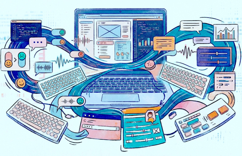
Designing for intent in a brave new world. Continue reading on UX Collective » Discuss children’s preference on avatar design Image created by AI tool ElevenLabs As a developer in a children’s hospital, I’ve designed some playful VR simulations for young patients. We try to avoid serious medical settings because there are still concerns about using …
Hyperlegible Sans: a free, open-source font for accessible design
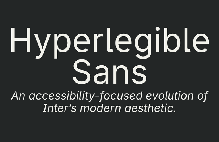
An accessibility-focused evolution of Inter that blends modern geometry with hyperlegible design principles. Hyperlegible Sans, a free, open-source typeface designed as an accessibility-focused evolution of Inter. Version 1.0 includes Regular, Medium, and Bold weights. Download Latest Font I’ve used Inter for years. It’s been my default across dozens of projects and, in my opinion, represents the best …
How reading patterns have changed
And it’s impact on UX and UI design Continue reading on UX Collective » What it takes to overcome obstacles and drive positive impact inside systems that resist change. Illustration by Sh8peshifters / Source: designingtomorrowbook.com Over the past years, I’ve spoken with many design students about life-centred design, responsible innovation, and bringing non-human perspectives into the …