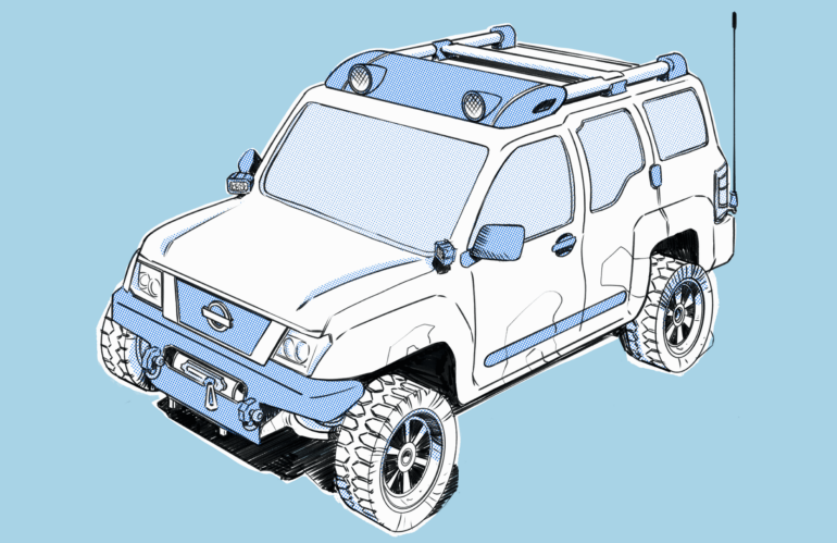
Building flexible design systems just like my Nissan Xterra.
The Nissan Xterra is awesome
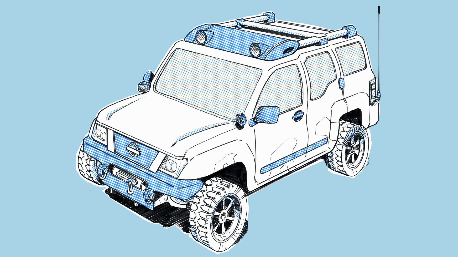
I love the Nissan Xterra. I’ve been driving an Xterra since I was in college (over 15 years ago). I’ve owned two in my lifetime, and I bought the first one twice. To me, it’s the ultimate sport utility vehicle.
And before you start quoting “The Office” at me, let’s take a look at this thing…
Four wheel drive, locking rear differential, stock roof rack, and a price that punches the Toyota 4Runner in the face. It’s a lot of bang for your 4×4 buck.
Or, at least… It used to be.
After our first daughter was born, I spent most nights walking up and down the hallway, holding her, praying that she would stop screaming and fall asleep. I had a lot of free time on my hands. One of my attempts to escape this nightmare of bedtime was to make it productive by reading about something I understood very little about: cars.
Do you panic every time the check engine light on your vehicle comes on?
I did. It meant that I was about to give abhorrent amounts of money to a man who would hopefully make it go away. Going to the mechanic made me incredibly anxious because of my lack of knowledge. But, as I moved into the season of parenthood, I decided to purge that fear from myself.
I read about my Xterra.
Eventually, my research turned into off-roading and overlanding. And I stumbled on the world of Xterra modification. This was camping in the wilderness, using crazy tools, welding vehicle armor, and survival.
It was incredible!
Did you know that the Nissan Xterra, Frontier, Titan, and Armada all use the same frame? And because they’re using the same frame you can actually swap out components from each system. If you want more travel in your front suspension (which you’ll need when offroading), you can swap out the Xterra or Frontier’s suspension for a Titan’s. It gives you a wider wheel base and greater travel for navigating difficult terrain.
It’s called a Titan Swap. It is awesome, and it is also an example of good systems thinking.
Nissan has developed a vehicle platform that gives it flexibility across a wide selection of vehicles. They leverage the same base component (the frame), and attached different components to that base in order to achieve the desired design.
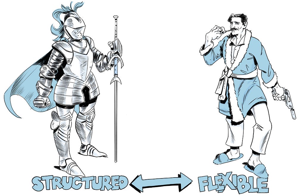
The best design systems embody structured flexibility
When building a design system, we should strive for a similar level of structure and flexibility. This gives us consistency while also allowing us to be adaptive and scale to our user’s needs.
With Cisco’s Momentum design system, the most obvious example of this is with our Tokens.
Tokens are variables or units of representational value. They can be colors, text styles, border radius, spacing, etc. Basically, anything that can be written as a variable. They allow us to scale change much easier than if we were to hard code values into our components.
My team and I are currently scaling Momentum across 30+ products within the collaboration business group at Cisco. There are a lot of needs that are present across all those teams. In order to offer the flexibility that they need, we’ve developed sets of tokens that product teams can apply to components in order to achieve their desired outcome.
So, for user facing products that need large calls to action, we can deliver big buttons and large typography. And for more administrative products, we can deliver a compact views of our components.
This is much better than having to generate variants of a component for every single possible use case. You should look at our old button sticker sheets. There are literally thousands of button variations, and those were built when we were just supporting a single product.
Balancing structure and flexibility
Tokens are an obvious way to make your design system flexible. But they’re not the only way. They’re becoming table stakes, and it is important that you think beyond them when building a flexible system.
How do you construct your components? How much control you exert of their usage?
Rules for how a component is used creates clarity. But as rules increase, flexibility decreases. There’s a spectrum that we work within between Flexibility (and therefore a lack of clarity), and Structure (lots of clarity, but no flexibility). It is very important for you as a design system designer to understand this spectrum.
How much do you trust the people using your system?
The more you trust them, the more flexible you can be. But, what do you do when you can’t trust them at all?
With Momentum, we want to trust our designers. However, we have over 200 designers across all of Cisco’s Collaboration business group. Because there are so many people here, we work hard to create a lot of clarity around on component’s usage.
There are a few ways that try to balance flexibility and structure in our design system:
Structure: Elevating Figma component properties
The more rigid you are in your structure, the more variants of your components you’ll generate. At a certain point for us, we had over 1200 different button variations. Anytime we wanted to make a change or update, it was a nightmare.
In order to scale component changes, we began to leverage the idea of “base components.” Check out Nacho’s overview here. Often, a component in our design system will be made up of one or more base components. Things get complicated when you want to decide what properties should exist in the properties panel.
Should your properties panel contain the properties of all base components, or should designers have to click into the component to change the base component’s properties?
As a team, we’ve decided to elevate as many properties as possible to the parent component, bringing all the controls into a single location. In general, this helps a user understand how to use the component at a glance.
Flexibility: Design system ambassadors
We’re not on the front lines. We’re not the ones building the product. We need people who are actually using this stuff on a daily basis. We have designers from across various product teams within our organization who have volunteered to work with us, learn more about Momentum than the average user, and try to keep their team on the right path.
We’re still trying to formalize this process. But in a large organization, it’s vital to have feature designers speak into the design system and how it’s built.
Structure: Training
We developed a training course for Momentum, called Momentum Academy (shout out to Julie for leading this project!). This course goes over some foundational aspects of Figma’s usage, the history of our design system, specifics on using our component libraries, and how to make requests.
The entire team worked together to build out lessons, design exercises, and record video demonstrations. We also held in-person working sessions with design teams who need some one-on-one time with us.
Cisco has a great, internal reward system called “Connected Recognitions.” With it, you’re able to award your peers actual money. We’ve leveraged this tool to incentivize designers to take the course.
Flexibility: Change requests
We have built out a design system change process and shared that with our organization. Our job isn’t to impose our rules and guidelines onto designers and engineers. We’re building a product. That product needs to be useful to the men and women in Collaboration who are building their own software products. We serve them. So, we encourage and empower designers to submit requests when they identify areas where our system might need to change.
Structure: Documentation
Each of the components in our design system has a large amount of documentation written about them. We’ve broken our documentation into several sections: Behavior, Anatomy, Tokens, and Accessibility. We also include detailed information on how designers can use the component in Figma.
Flexibility: User research
We try to survey our users every six months to understand the effectiveness of our system. In addition to the quantitative data gathered in our surveys, we have facilitated several research projects. Usually, this involves contextual inquiries with our participants, asking them how they use the design system, and asking them to complete different tasks related to its usage.
It’s surprising what you learn when you ask someone to actually use the tool you’re building on a daily basis. We realized that designers in our organization were primarily pulling components from the assets panel instead of copy/pasting from the sticker sheet. Because of that, we had to make sure that they understood which libraries were enabled and which components were from that library. At the time, Figma did a very poor job of identifying component libraries, and it was very easy to pull a button from our iOS library, a dropdown from our Windows library, and a header from our MacOS library.
Knowing your users creates innovative solutions
Overall, our objective as design system designers is to empower our users. We need to build a platform that, like Nissan, gives users both structure and flexibility. We want our designers and engineers to feel like using our system makes their life easier. And in order to make their lives easier, we need to know them, their workflows, and their primary pain points.
Going offroad for a better design system was originally published in UX Collective on Medium, where people are continuing the conversation by highlighting and responding to this story.