A cautionary tale of email deliverability, retention, and LTV.
Every so often, I do a big email prune.
So, there I was in bed last Sunday morning going through my 2,000 unread emails.
And I saw one where I thought to myself
“I swear I’ve unsubscribed from this brand before…”
It was my pet insurance provider.
So I click through to unsubscribe but find it so incredibly hard to unsubscribe that I give up.
I exited the flow.
Staying subscribed ‘till my next cull.

Then I realise:
“This must have been what happened in my last email prune: I gave up.”
It was a small thing, but it really bugged me.
It made me distrust the brand just that little bit more. I’m giving them £40 a month for Stanley’s (🐶) insurance, but they won’t even let me unsubscribe?
Weird.
After that point, I started to pay attention to email unsubscribe flows in my inbox.
How easy is it to unsubscribe? How do I feel towards the brand as a result? How many clicks does it take me?
I collected all the unsubscribe flows together, reviewed them on a macro level and found that there’s a spectrum — some good, some bad, and some… a complete car crash.
Let’s go through them in more detail and talk about why — even though this feels like a small detail — your email unsubscribe flow is crucial to retention, lifetime value and brand affinity through CRM.
And why, as counter-intuitive as it seems, you should actively encourage people to unsubscribe.
First, the theory of why letting people go gracefully impacts your email performance so much.
How unsubscribes relate to email deliverability
Having a high-quality list — by allowing people to unsubscribe — means you’re more likely to score highly on email deliverability.
Something I only found out recently.
I used to ignore email deliverability. It felt technical and dense.
When the topic came up, my brain switched off. Instead, I was attracted to visual things like copy and design.
However over the years, I’ve come to see how you can spend months crafting nice email copy, great offers, beautiful designs, all for it to come to nothing because your emails aren’t actually getting to inboxes.
Hubspot defines email deliverability as:
The number of emails that were delivered successfully, no matter the folder. It tells if the recipient’s mail server has accepted the email file and delivered it to the receiver.
Meaning: that if you send 100 emails and have a deliverability rate of 95%, then 95 of those emails will arrive in the inbox. 5 will not be delivered at all, as they ‘bounce’.
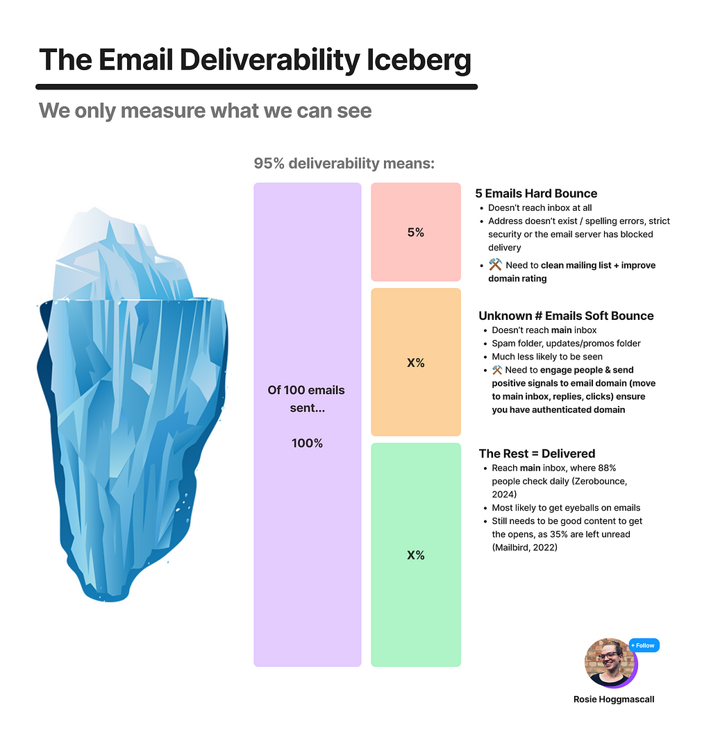
These are hard bounces. There are hard and soft bounces, and only the hard ones are measured with email deliverability:
- Hard bounces: A permanent reason that an email cannot be delivered. Like the address not existing, spelling errors in the email, their inbox has strict security measures or the email server has blocked delivery entirely (if someone’s account is suspended).
- Soft bounces: This means your email didn’t arrive to their main inbox, but you can in future. They’re temporary bounces. Such as: their inbox is full, your email is too large or the email has been flagged for phishing or spammy keywords — like if you put ‘BUY CRYPTO 💸🤑’ in the subject line…
(I’ve actually had a client see problems with money emojis in subject lines before. Beware.)
So, soft bounces are harder to measure. And they’re not included in ‘deliverability’ statistics.
Deliverability percentages are, therefore, only part of the story (hence the iceberg analogy).
One important thing to remember is that once you harm your email domain rating, it is hard to reverse.
Less emails get into the right part of the inbox, which means they get less positive signals sent back to Gmail, Yahoo etc., which plummets your score even more.
You get into a vicious cycle of declining open rates, click rates and deliverability, which can take 6–10 months plus to recover.
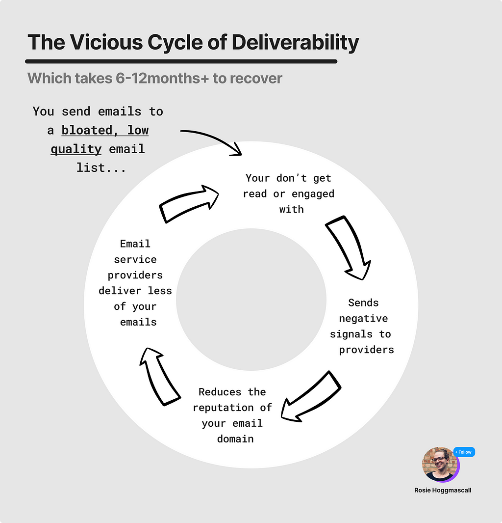
Things that can harm your email domain quality are:
- Sending out lots of mass, infrequent campaigns
- Sending out irrelevant content to people
- Sending out poor quality content
- Having a large cohort of users who never open, click or respond to your emails
- Having a single opt in (i.e. when people don’t have to verify their email address)
- And, making it hard to unsubscribe
All these practices reduce the open rates and click rates, which sends bad signals to Gmail, Apple Mail, Yahoo & other providers. Which means you get in their bad books and ultimately they stop sending your emails to people because you look suspicious.
The importance of a good unsubscribe flow
According to Zerobounce:
49% of users will submit a spam complaint if the email doesn’t give them a way to unsubscribe.
We want to make it easy to unsubscribe. However for some people, this feels counter intuitive. They think:
We need to grow our email list size — we’re all about growth. We don’t want churn!
This is especially the case when brand partnerships are a big income stream for you. Teams are tempted to sell the dream of a large list size to partners to generate more revenue.
Short term, this may be a nice bump.
But in the long term, what matters is a healthy email list, with high engagement rates and high deliverability rates.
When we encourage people unsubscribe, we’re ‘cleaning’ the email list. Making sure the people left are engaged and moving the average open rates and click rates up.
Sending a higher proportion of positive signals to Apple, Gmail, Yahoo etc. means that you will look more legit (i.e. you’ll have a better domain rating) and more of your emails will land in inboxes (i.e. you’ll improve your deliverability).
So, in sum:
- You need to maintain a high quality list
- To maintain high engagement rates on your emails
- In order to avoid the viscous cycle of deliverability
- Which means that you need to make it easy to unsubscribe
Makes logical sense.
So most brands do this right?
…
Wrong.
I took a sample of 8 brands: Braze, Pinterest, Customer.io, Microsoft, Bloom&Wild, American Express, Waggel and Songkick. And only half of them had a good unsubscribe practice.
Let’s run through them together and look at the unsubscribe flows, the clicks to unsubscribe and what this means for the quality of their email list.
Friction to unsubscribe
I counted a range of clicks-to-unsubscribe. We had the easiest (one click) to the hardest (5+ clicks, where I gave up).
As a higher-level summary, from best to worst there was:
- Braze (one click)
- Pinterest (2 clicks)
- Customer.io (2 clicks)
- Microsoft (2 clicks,)
- Bloom&Wild (3+ clicks)
- American Express (3 clicks + email entry)
- Waggel (endless clicks trying to log in)
- Songkick (endless clicks trying to log in)
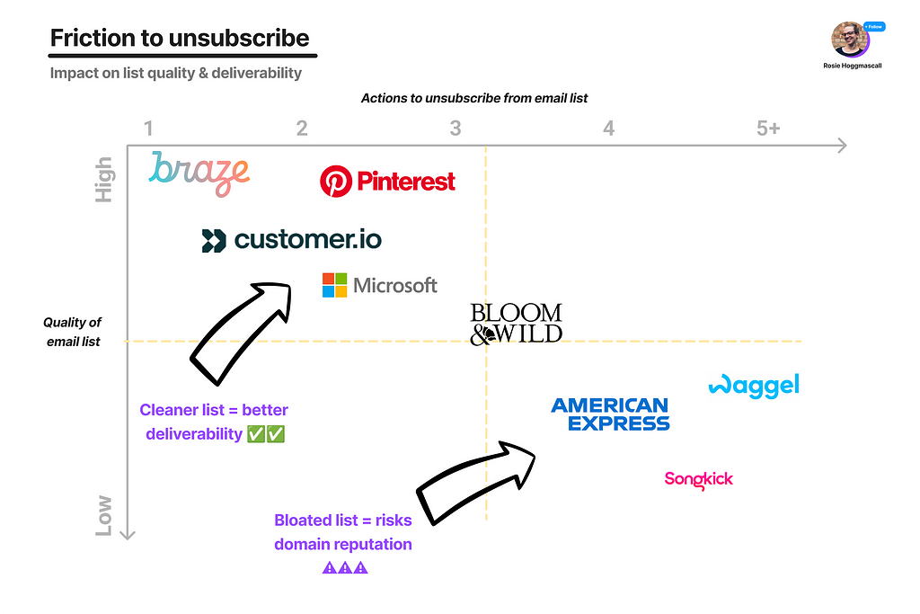
Let’s dive into the detail of how they do it.
One-click unsubscribes = 😍
First up, Braze a US-based customer engagement platform that does upwards of 130 million USD a year (2024).
This was my favourite flow.
I’m not surprised that a B2B Saas tool for emails uses best practice with email subscribes here, but it is still worth calling out why.
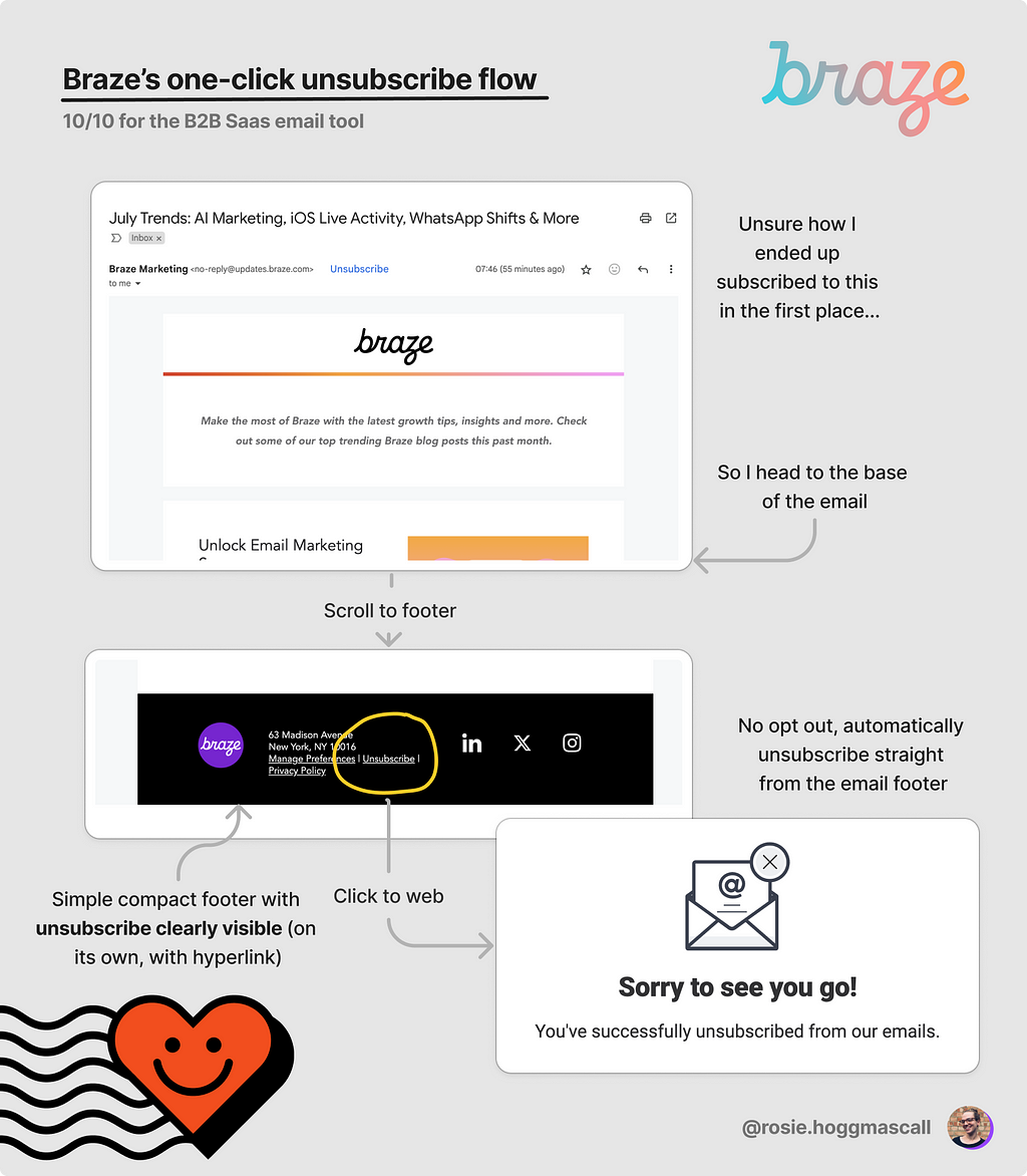
I scrolled down to the end of the email and saw the unsubscribe link at the bottom, clearly visible in the compact, concise footer.
With that one click, I’m unsubscribed. I’m taken to a web page that confirms my unsubscribe.
No extra action needed from me. This flow couldn’t be any more frictionless (unless perhaps if the unsubscribe was in the header).
People rarely scroll all the way to the bottom of an email and click ‘unsubscribe’ by accident. Therefore, in my view there’s little risk of unintentional churn here.
There are only three things that could have been better:
- Make the unsubscribe page a bit more on-brand (currently feels like an old-school clipart image)
- Avoid confirm-shaming language like ‘sorry to see you go’. Directness is better
- Change the copy in the footer to set the expectation, e.g. ‘unsubscribe in one click’
When I scrolled to the bottom of an email from Songkick (a concert booking site), I thought I’d have a similar experience as their footer said:
Unsubscribe in one link
‘Great’, I thought. This will be as easy as Braze.
Not so fast.
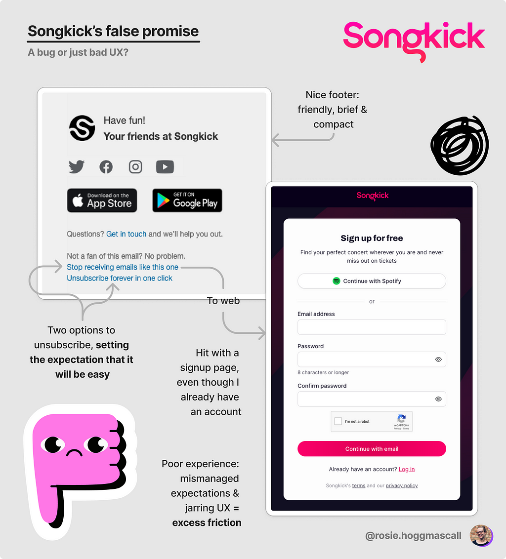
Instead of being unsubscribed, I’m taken to a log in page…?
Part of me thinks this is a bug. If it’s not, then this is just poor UX and a mismanagement of expectations.
I ended up staying on the list as I couldn’t be bothered to log in. Not a good thing (remember from our theory section) as Songkick will be bloating their list, reducing their open and click rates, and therefore harming their overall deliverability.
Next, two-click flows.
Two-click unsubscribes = 😊
I went to the Cannes Lions Festival of Creativity this year. At which, I had to give my email address to big tech companies to get into venues. And I received a lot of unwanted mail as a result.
One such sender was Microsoft.
I have no idea what the point of this sequence is ‘What’s the truth about AI’s impact on work’ 😂 so I go to unsubscribe.
And, it’s pretty easy. Takes me two clicks.
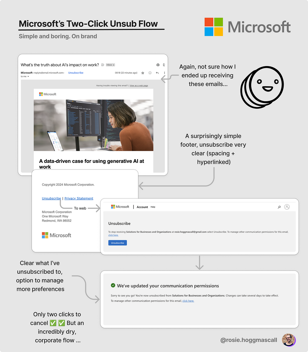
The unsubscribe link is clear in their simple footer. I then head to a page with one CTA ‘unsubscribe’. I click it once, and I’m done.
Easy yet incredibly boring brand-wise. Classic corporate-playing-it-safe. No harm done though, which is bare minimum.
It’s a very similar flow to Customer.io (another CRM tool and a big competitor for Braze).
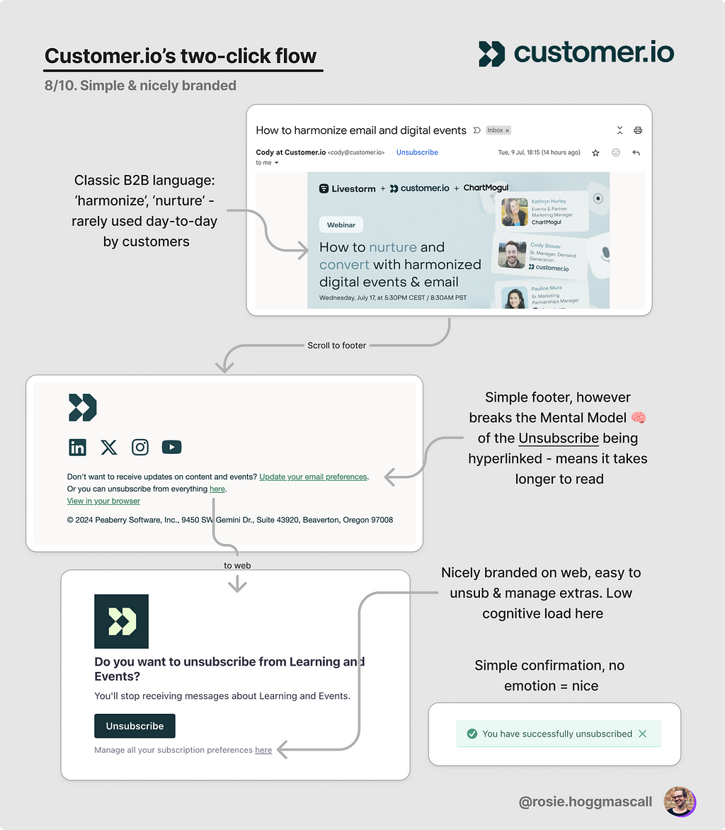
What’s different Customer.io to Microsoft is that the former has a flow which is branded and doesn’t feel so clinical.
However, Microsoft does better on the footer — as you can see above that it takes me a hot second to find the link to unsubscribe in Customer.io’s flow.
But again, no harm done here. Feeling neutral-to-positive after this interaction with the brand.
It goes down hill from here.
Email enter unsubscribes = 😐
Now, onto Amex. There’s something about their emails which is like walking into a crowded bar when you haven’t drunk anything yet: completely overwhelming.
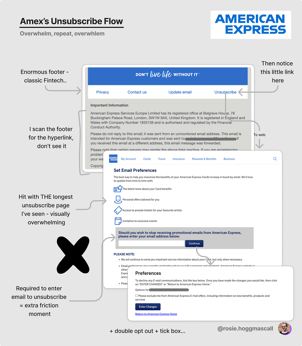
Their email footer is overloaded. It takes me a while to find the unsubscribe link (which blends in like part of the furniture).
After clicking, I’m taken to a page of benefits of their emails. Which is a laundry list of reasons I should stay.
Personally, I think this is too late. If I’d seen this value in the emails, I wouldn’t have tried to unsubscribe in the first place.
What’s annoying about this flow is that I have to enter my email address to unsubscribe.
And then it’s a double opt-out. So three clicks in total, with some typing too.
Not ideal. Quite annoying.
Almost as annoying as a laundry list of preferences.
Preferences selection = 😕
Now, I actually used to suggest preferences selection as a way to reduce unsubscribes.
But over the past few years, I’ve come to believe that it’s better for a brand to make these decisions, and take that choice away from the main flow so that the journey is as frictionless for the majority.
If a subset of users want to set their preferences, by all means let them. But don’t put it in everyones faces, or else you’re using decision paralysis to increase friction in your unsubscribe flow.
Take Bloom&Wild, a popular British flower delivery service. Their emails are clean and clear (I’ve written about them in detail before), and the unsubscribe link is easy to find.
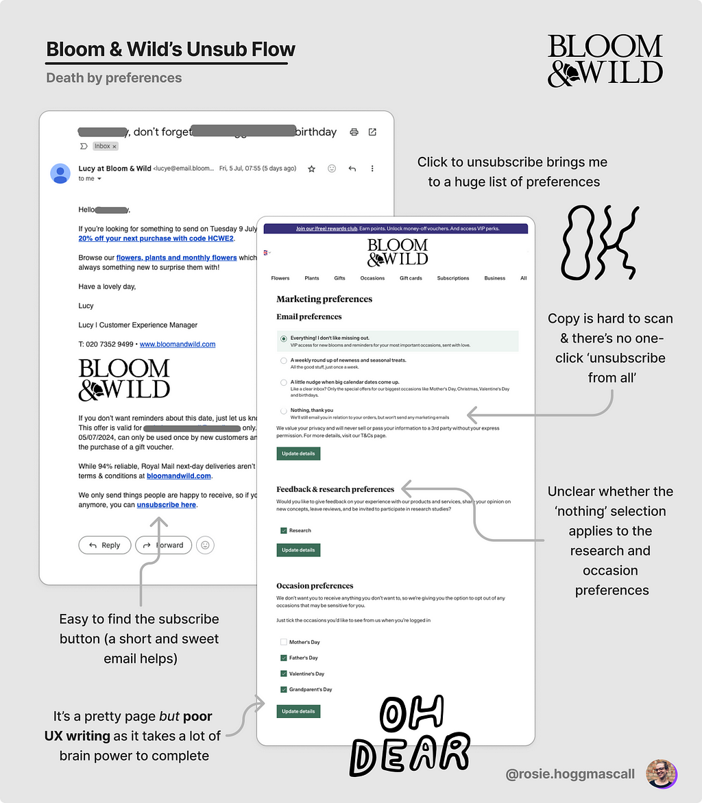
However when I head to the unsubscribe page, I’m hit with a wall of preferences. Most of which feel confusing and unclear.
What would be better here is an ‘unsubscribe from all emails’ up top.
Or, like Pinterest — one big button to unsubscribe, with a smaller link for ‘manage other email settings’. A great example of Progressive Disclosure (i.e. don’t overwhelm people, ease them in gradually).
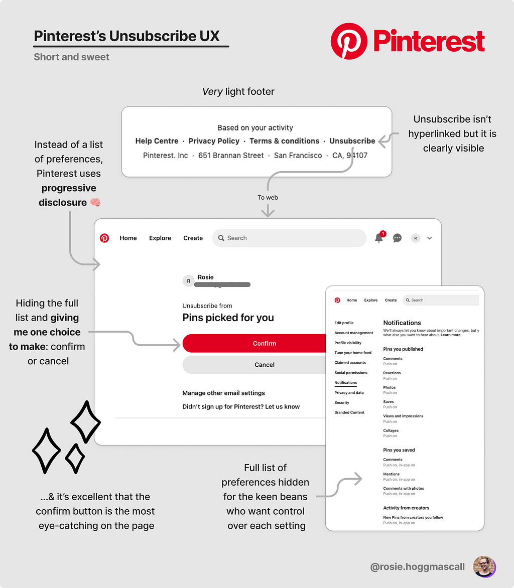
This way, I’m given one choice. As a user, I’m also not expected to understand all of Pinterest’s campaigns. It tells me I’m unsubscribing from ‘Pins picked for you’.
I also love that the biggest, brightest button is unsubscribe button.
10/10 for Pinterest.
Now onto my least favourite and the culprit of this article: Waggel.
Log-in to unsubscribe = 💀
I’ve been with the same pet insurance provider since my dog was a puppy. Coming on three years now, meaning my LTV must be well over £1000 and rising.
With this level of retention, you may think they have a strong email strategy.
Nope.
I open very few of the emails.
None of them are relevant to me and my pet: buying wines (?!), signing up for different products, new company address, pet charity, pride (for pets?).
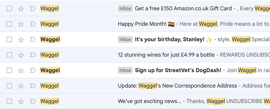
So, after a while I realised I should just unsubscribe.
I head to the bottom of the email to a very clearly placed unsubscribe link (underlined and in capital letters).
I click on it, and head to….
A log in page. For which I cannot remember my password given the last time I logged in was 3yrs ago.
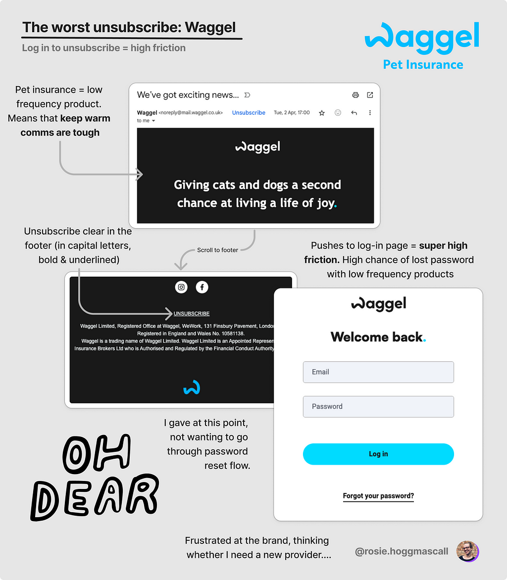
Now, I can’t make up my mind here. Either:
- This is intentionally difficult, as a way to keep people subscribed.
- This hasn’t been given any thought from a UX perspective.
On 2, I get it. Resources are tight. Sometimes flows like this get overlooked.
On 1, I hope this isn’t the case. But if it is, the quality of the list for Waggel will be lowering and lowering, impacting their ability to send important emails when they need to.
If you harm your deliverability, you’re going to be less effective as sending communication that aim to retain, upsell and cross sell simply because your emails won’t land in the main inbox.
Bad idea.
In sum: make it easy peasy to avoid deliverability risk
The unsubscribe flow is a small one, but an important one.
Here’s what we’ve seen from the best-in-class on how to do unsubscribes well, and maintain a high-quality list:
- Make your unsubscribe link scannable in your footer — e.g. use the mental model of bold, blue hyperlink, capital letters, with lots of spacing so it is easy to spot. Make sure you use the word ‘unsubscribe’ not a variation of
- Go for a one-click unsubscribe, max two-clicks. Do not under any circumstances get people to log in (big no no).
- If you want to retain people on different campaigns, clearly state that you are unsubscribing them from that flow. Offer them a way to manage their preferences in a way that’s easy on the eyes.
With this, you can encourage the unsubscribe and maintain a good list. With open rates of 45%+, click rates of 5%+ and a deliverability of above 97%. Now that would be healthy performance (on average) for an email campaign.
Any more tips on email deliverability? Would love to hear in the comments 👇
Why you should never hide your email unsubscribe link was originally published in UX Collective on Medium, where people are continuing the conversation by highlighting and responding to this story.
