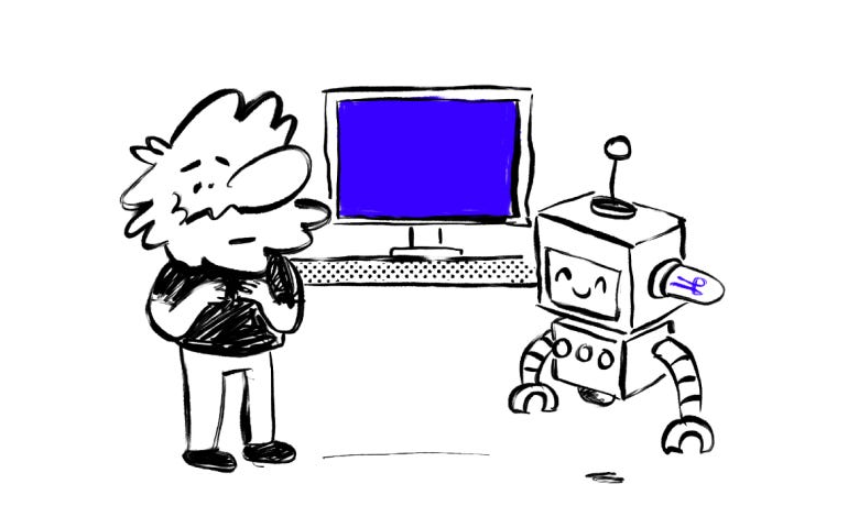
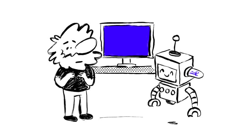


No matter what you tell them, LLMs somehow always use the same design choices. Purple–gradient–rounded buttons.
Even when you feed them all the guidelines, PRDs, and rules, they still struggle to follow simple instructions consistently, especially when you give them multiple design guidelines at once.
You can say plz, make it minimal, brutalist, sharp edges, monochrome, and somehow you still get… more purple. Probably because that’s what they’ve seen a million times in their training data. It seems like these models learned good design from whatever was popular on Dribbble between late-2010s and early-2020s.
At v0 (shameless plug), the team’s been working on fixing this — using design systems and registries to give models structured context about components and how they relate to each other. Instead of letting the AI freestyle everything, people can give it a rulebook it actually follows.
With shadcn, you can define your design tokens once, and the AI stays inside those constraints. And… there’s more stuff coming… but can’t talk about it yet lol
Anyway, the robots love purple. But they’re slowly learning there to use other colors.

Purple 💜 was originally published in UX Collective on Medium, where people are continuing the conversation by highlighting and responding to this story.