

7 tips for creating the worst design story titles from a UX writer.
A basic quality tool for problem solving
Showcase and explanation of a simple but powerful problem solving diagram to manage both simple and complex cases individually or with large teams
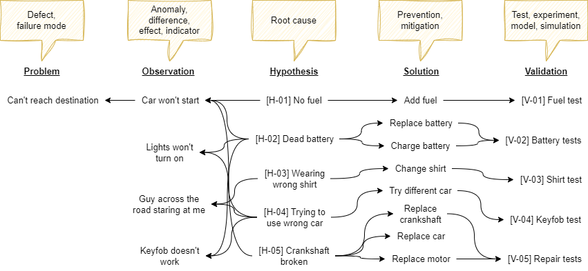
The diagram on the cover page pretty much sums it up. Five columns, each linked by an arrow indicating a relation to the neighbouring column(s). It provides a fairly complete, single view of the problem-solution space. It won’t solve the problem for you, but it can be used as a tool to manage complexity, collaboration and chaos by providing insight and overview.
While I think the diagram itself is pretty intuitive to anyone who’s ever faced a problem solving situation, the rest of this article goes into more depth on how, when and why it works, and includes the story of how it came into being.
How it works
The way to read the diagram is to start with the hypothesis, then move to the left. If the hypothesis is true, then what would the subsequent observation be? Consequently, what would the problem be? Also, are there any observations that are not problematic? Perhaps these are related, early-warning signals? Or they have nothing to do with the problem.
Now shift back to the center. Again, assume the hypothesis is true. What would a solution be? Note that I’m not saying it is true. I’m just asking to entertain the thought, and find a solution regardless. This column is particularly useful, because prevention or mitigation may — in some cases — actually be faster, easier or cheaper than testing the hypothesis!
Finally, it is important to validate imagined solution(s), usually by experimentation or simulation, and the rightmost column describes this. Assuming you decide to implement the suggested solution, what would be the test to validate the solution?
“It links the problem to the solution in a single view”
Numbering of the hypothesis and validation columns is useful to keep track of individual items for documentation, work breakdown or budget allocation purposes.
The relations between each column item are denoted with arrows, placing the hypothesis in the center, and the other columns left and right of the hypothesis as follows:
Problem ← Observation ← Hypothesis → Solution → Validation
Here, the words are just symbols to refer to a specific category in the problem solving space. Words like failure mode, effect and root-cause are commonly used in six-sigma or other quality contexts and can be used interchangebly for problem, observation and hypothesis, respectively.
Why it works
It links the problem to the solution in a single view, and is mostly a communication tool. The canvas-based approach allows rapid alignment because everyone is looking at the same shared “truth”. Additions and feedback can immediately (realtime) be processed during discussions.
It was most useful at times when chaos started to unfold. By chaos, I mean the situation where people are starting to talk past each other, or where unsubstantiated rumors pollute the shared problem-solution space. Both can be detrimental to progress and team feeling if left unattended. By bringing people back to the shared truth, the growth of chaos is halted.

The diagram also reveals probabilities and consequences quite rapidly. In the cover page example, someone might state “I heard some noise, the crankshaft must be broken and therefore the car won’t start”. While this may throw off a verbal discussion, the diagram enforces a structured information model which shows there’s no clear evidence or indicator to support this claim. It also shows that if the hypothesis were true, the consequences would be huge.
“It was like a chaos relief valve”
Finally, most problem-solving techniques focus on what you don’t want. It’s even in the name: root-cause analysis. Understanding a root-cause does not guarantee a solution. By including potential solutions in one diagam, a focus shift towards solution synthesis occurs, which is what you do want.
How to make one
While it doesn’t really matter where you start, it helps to make one person responsible for actually making the diagram. Ideally this is done live and in-person, with the whole team. Just begin populating the columns and links in any order that feels like it makes sense to the problem at hand. A sense of pattern-recognition should occur naturally after a while.
You can use any preferred method for the creative process of populating the columns (I recommend fishbone diagrams for hypotheses).
Also, this isn’t a one-time visualization. It’s a living canvas, being continuously updated as the process evolves. We found that it was useful in the early stages, also serving as visual aid to explaining the rationale behind our course of action. While it wasn’t really used during experimentation or discussing test results, it was brought back into view immediately whenever chaos was unfolding again.
It is important to strive for completeness, but legibility is more important (keep it on one screen). You can either make a new diagram for each problem/failure mode or merge any column’s items into categories. Do not split the diagram any other way, this will destroy the reason why it works.
Software and data management
I personally used draw.io to create and maintain the diagram, but any diagram-making tool (e.g. MS Visio) would be suitable. Unfortunately, this does still require linking the actual records to additional experimental data, pictures, reports etc.
That having said, for most cases it should be workable to maintain numbered items in whatever data management software you use (Excel, Access, JIRA, Airtable, etc), and simply use this number in the diagram. Feel free to leave a comment if you have any questions on this.
The story behind it
Real-world example
The image below is a screenshot of an actual problem solving case that took 4 months and involved a ~5 people core team with supporting experts across multiple locations, totaling ~20 contributing members.
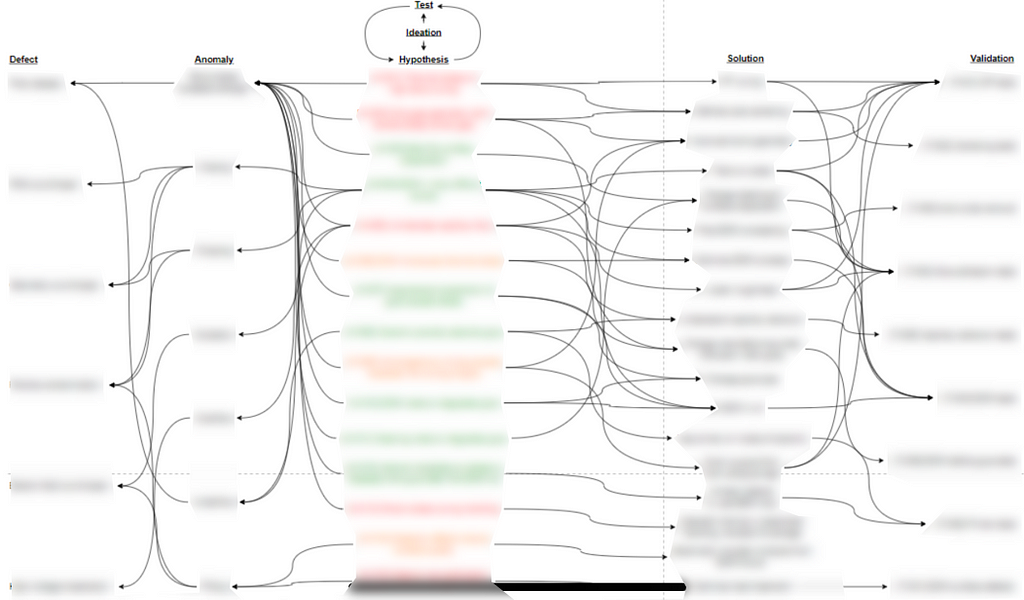
While the contents are blurred for obvious reasons, it is clearly visible how the complexity of this case was captured in a single, easy to grasp visualization. It proved very useful in keeping everyone “on the same page” throughout the project.
The problem
The problem was a new product manufacturing problem that escalated heavily for two reasons:
- Extremely low yield on first prototypes (> 90% scrap)
- It wasn’t getting solved (for months)
Needless to say, our customer wasn’t happy. Now this particular module was never made before, so expecting 100% first-time-right is unrealistic. However, it was on the critical path for a complex machine, which meant all eyes were on this problem. And 90% scrap is very rarely acceptable :).
Fast-forward to today: the problem is resolved. Looking back, the most difficult part was actually “keeping all frogs in the basket”, as someone from the team stated quite eloquently, referring to the problem of maintaining focus and effectiveness with a new team, while solving a difficult problem under high pressure.
The cloakroom problem
The initial response was to open up a proverbial can of engineers by pulling them from other projects, ask them to assemble into a new team and resolve the issue. Challenge accepted.
In my role as technical lead of the team, I was ultimately responsible for decision making, but was quickly overwhelmed by chaos that ensued during the initial brainstorms. I felt like I was the clerk behind the counter of a cloakroom: trying to accept all types of information immediately, while storing it in a logical and retrievable way for everyone (including myself).
I thought to myself: “How do I get everyone on the same page?”
The initial stages were very messy. Despite being guided by principles of 8D, fishbone diagrams and root-cause analysis techniques, there wasn’t actually something that brought it all together. What are we actually going to do first? And why? I was looking for a Systems Thinking approach. Not just making lists, scheduling Gantt charts and pretending we have control over the situation.
Meanwhile, our upper management was asking on a near-daily basis “Who else do you need?”, “What are the first experiments you will perform?”, “What is the running hypothesis?”, “How much money do you need for hardware?” — All very supportive, but I couldn’t answer any of these questions, not with clear reasoning. There was no grip on the situation.
The pattern
After a few days of discussions, brainstorms, analyses, one-on-ones and other creative sessions, I noticed that people were contributing in one of five categories:
- Observations (differences, anomalies, failure modes)
- Hypotheses (root causes)
- Solutions/mitigations (what to do about it)
- Experiments (ways to test hypothesis or validate mitigations)
- Specifics (any key-value combination, e.g. “temp. should be 100 degC”)
Immediately after this realization, I started doodling on paper silently during a team brainstorm. I tried summarizing what everyone was saying into either of those categories. And it worked. I drew what was an early diagram on screen, and it was like a chaos relief valve. Suddenly, there was this sense of grip on the situation. Well, at least I felt it.
We listed the main hypotheses and observations, and agreed to park the solutions, experiments and specifics for now. Quite naturally, the relations between observations and hypotheses became explicit. It also became clear that not all observations (anomalies) actually lead to problems (failure modes).
The diagram formation
With the momentum gained from the sense of chaos relief, I doodled some more using pen & paper in private. I wondered if it were possible to capture something that could answer questions like “What exactly are you doing to prevent X” or “Why exactly are you doing this experiment”, and immediately point out the rationale behind anything we do.
Initially, I created a sort of morphological overview of all specifics, but quickly realized that would grow out of control and not show relations. I then just wrote down the contribution categories, separating observations and problems, and formed a sort of causal diagram to make the relations explicit. This worked okay, but it needed a list format, because any category could grow as the project progressed.
By putting down the categories in columns allows for list formation and keeps the causal relations: bingo. Some pruning and sub-categorizing later and the diagram was complete.
Take-away
Please keep in mind that this is just a tool. It’s not a fix-all, nor does it relieve you of thinking, which is still the most important factor in any quality-related issue if you ask me.
That having said, this diagram helped me obtaining a maintaining a grip on a complex problem solving case involving dozens of people. I am hoping it does the same for anyone reading this.
A large part of solving complex problems relates to the application of logical reasoning. If you’d like to learn more, please refer to one of the following great resources on this subject:
- Architectural reasoning
- Causal reasoning
- Deductive, inductive and abductive reasoning
- Systems thinking, learning & problem solving by Ackoff (recommend!)
— Matt
A basic quality tool for solving problems was originally published in UX Collective on Medium, where people are continuing the conversation by highlighting and responding to this story.


