Skimming isn’t the death of reading, it’s the beginning. What matters is whether design leaves readers at the surface, or builds the doorways that invite them into depth.

Benjamin Cain recently published a polemic against “skimmable texts”, arguing that only fake readers want to read while multitasking, and only fake writers infantilize their audience. In his view, bullet points, short paragraphs, and snackable writing are not just shallow — they’re sophistry in disguise.
It’s a sharp take, and it resonates with a frustration many of us feel about attention collapse. But I want to push back. Not because Cain is entirely wrong, but because framing skimming as “fake reading” misses the point. Skimming is not fake. It’s real behavior, and it tells us something important about how reading is evolving in a digital age. Skimming may look shallow, but it’s an opportunity to design bridges that carry readers from quick encounters into substance.
Skimming is real, not pretend
To say that skimmers are “fake readers” is to deny reality. People skim because of context: they’re reading on a smartphone, in between tasks, in line for coffee, or late at night before bed. Their attention is fragmented, their time constrained.
In my own reading, I’ve noticed how quickly I move past headlines, barely catching more than a phrase. Maybe you’ve noticed the same. That’s not laziness — it’s survival. With so many headlines, notifications, and updates flooding us every day, skimming becomes the instinctive way to sort, filter, and make sense of the overflow.
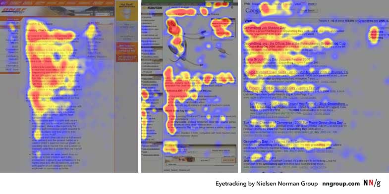
Eye-tracking studies show that this survival instinct even leaves a visible trace: the “F-pattern” of reading, first observed by the Nielsen Norman Group. Faced with a wall of text, our eyes dart across the top line, skim further down, and then track vertically along the left margin — tracing out a crude “F.” It’s not fake attention, it’s fast attention. A way of hunting for signal in a flood of noise.
Cognitive scientist Maryanne Wolf adds the “why”: humans weren’t born to read — reading is an invention — so our brains build a circuit for it, and on screens we default to skimming as a defense against overload. Deep reading, she says, is a “fertile miracle of communication in solitude.” Design shouldn’t fight the skim; it should meet it, then gently invite readers toward that sanctuary.
Time is the scarce currency
Cain critiques skimmers as impatient multitaskers. But beneath that impatience lies a truth: time is the scarcest resource in the modern information economy.
We live in a world of infinite feeds and competing claims for attention. Skimming may look shallow, but it’s really an adaptation, our way of coping with too much information chasing too little time.
Seen this way, skimming isn’t fake. It’s a signal that our design of reading experiences must evolve to meet the reality of time scarcity.
Curation as the true gatekeeper
This is where the opportunity opens up. If skimming is the default entry point, then curation is the compass. And design is the map.

The Nielsen Norman Group’s own website leans into the F-pattern: bold, left-aligned headlines at the top, concise summaries stacked neatly below, clear sections separated with whitespace. Readers can scan fast, yet still encounter clarity and depth. That same principle applies everywhere: thoughtful layout and curation turn scanning into orientation.
Good curation goes beyond the surface. It creates a doorway to depth, guiding readers from quick takeaways into the stories and ideas worth sitting with.
And curation doesn’t have to be purely mechanical. It can be deeply human. Sometimes it’s a manual choice by an editor who knows the heartbeat of a story. Sometimes it’s a recommendation engine that learns what resonates with you. The best curation feels like a friend pointing you toward the next thing worth your time, not a machine pushing content, but a guide who helps you stay connected to the story.
When skimming and curation work together, the result isn’t infantilization — it’s empowerment. Skimming becomes the front gate, curation points to the paths worth walking further.
The false binary of substance vs. skimmability
Cain sees a direct tradeoff: substance requires length, logic, and patience — while skimmability cuts away substance and leaves only fluff. But this is a false binary.
Skimmable doesn’t have to mean shallow. With thoughtful curation, short forms can preserve meaning, logic, and imagination. Summaries, highlights, and bullet points can be entry points, not endpoints.
Skimming may look like the enemy of depth, but it can just as easily be the invitation to go deeper.
Writers and designers share the responsibility
The task isn’t to shame readers for impatience or to strip everything down into fluff. The real task is to design transitions:
skim → curated doorway → depth
That means building structures where the busy reader still gets value, but the curious one can step further in. It means designing formats that respect both time and intelligence.
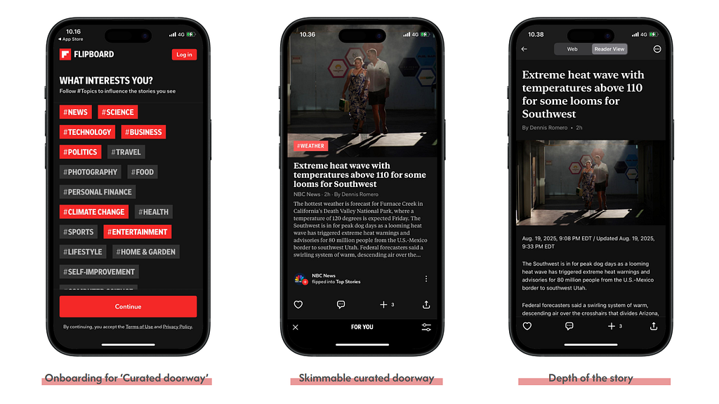
One way to see this in action is Flipboard. Its design embodies this sequence:
- Onboarding starts with curated interests (the “doorway” into relevance).
- Feeds are skimmable by design: bold headlines, short previews, and tags that respect F-pattern scanning.
- Articles provide depth once curiosity is sparked, letting the reader step into the full story without friction.
Flipboard doesn’t fight skimming, it works with it, transforming scanning from the end of attention into the beginning of engagement.
This is the frontier I find most exciting: quick-swipe summaries, layered storytelling, interactive reading — all ways to make depth accessible without turning skimming into a dead end.
Imagine we can build anything that respects the readers. Instead of treating skimming as a flaw, we can design it as the beginning of a journey. Respect means making every glance valuable, but also leaving doors open for those who want more. It’s less about choosing between shallow or deep, and more about creating layers of meaning that adapt to attention.
That respect can take many design forms:
- At a glance → bullet summaries, highlights, or bold key phrases that make even a quick scan rewarding.
- The doorway → curated cards, interest-driven feeds, or contextual links that guide without overwhelming.
- The depth → structured sections, inline explanations, or a toggle between skim mode and deep-read mode that honors curiosity when it appears.
When skimming, curation, and depth align like this, we stop forcing readers into one way of consuming. Instead, we treat their attention as a gift — earning trust at every step. And that trust is what turns a fleeting glance into lasting engagement.
Reading is transforming
Cain is right about one thing: if writers only compete for entertainment, text will lose to video, games, and memes. Reading cannot win by becoming “verbal video.”
But that doesn’t mean reading is dying. It means reading is transforming. The challenge is to reimagine reading for a distracted age — not by rejecting new behaviors, but by designing new forms that honor both speed and substance.
As Will Leitch recently reminded us, the magic of publishing was never about traffic spikes or SEO tricks. It was about the joy of creation — putting something into the world that wasn’t there before. In the same way, the magic of reading has never been about format. It’s about the journey: from a glance to an idea, from skim to substance.
Closing reflection
Skimming may look like decline, but it’s really a design challenge. A chance to rebuild reading so it fits our fragmented attention while still leading us into depth.
Because the future of reading won’t be shaped by those who deny skimmers. It will be shaped by those who build curated doorways — the best gates from quick encounters to lasting meaning.
Author’s note:
I’m still learning about this myself. These reflections are part of an ongoing exploration of how reading, attention, and design intersect in the digital age. If you’d like to see where some of these ideas started, I wrote more on how digital design shapes our experience of time here: Designing time: How digital products shape the way we live it.
From skim to substance: Designing the future of reading was originally published in UX Collective on Medium, where people are continuing the conversation by highlighting and responding to this story.