How the UX of AI chat can hijack our brains to compromise learning in schools and beyond

Ask any instructor what helps students learn, and it’s unlikely any of them will answer “a really big wall of text”. It’s incredible to me, as both a university instructor and a UX designer, that the army of people working at OpenAI are not imagining better tools for our students. I want to walk you through a design pattern in ChatGPT that, despite its good intentions, might be creating unintended hurdles for students.
I’m talking about “verbosity compensation”, which is an LLM’s tendency to provide overly wordy answer.
We’ve all seen it. You ask for help, and the AI provides a dense, multi-part response, that sounds like high-quality until you look closer. The challenge for learning specifically, is that managing the learner’s cognitive load is critical, and presenting information this way can be overwhelming. It’s a bit like asking how to boil an egg and getting the entire science of how water boils, the protein structure of an egg, and two egg salad recipes in response.
Let’s dive into ChatGPT’s “Study and Learn” mode with both our cognitive science and UX design lenses. By the end of the article, I’ll explore potential interface ideas that could help with learning.
All the steps at once
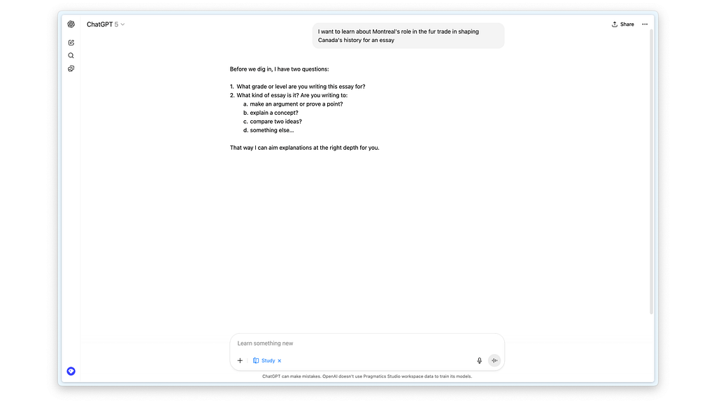
To start, I used a simple, real-world prompt from a student: “I want to learn about Montreal’s role in the fur trade in shaping Canada’s history for an essay.”
You can see in the response below how heavy the answer is compared to the request. Yes, the student didn’t do a good job being specific, but as non-experts we should expect that they won’t always know.

When I broke down the response, I saw it was trying to do four things at once: ask the students’ grade, provide facts, suggest an essay structure, and ask if the student wanted to continue.
However not all of these are immediately appropriate when a student comes in with an uncertain request. To make this easier to follow, let’s give each part of the answer a name so we can analyze them more closely:
- Requirements gathering
- Additional context
- Structure recommendation
- Task confirmation

Now as UX designers, you know how important it is to structure steps to avoid overwhelming the users. It’s the reason why wizards and screen-by-screen flows are used in any task that requires multiple levels of user reflection, input, and confirmation.
Below I highlighted how each of these four steps has different expectations from the user, from needing user input to simply informing them.

Let’s compare the ChatGPT response, with an Amazon checkout flow to highlight this gap. Looking at the screens below, notice how each step has a discrete action requested from the customer, and just enough information for the customer to make an informed decision.

Now imagine if the the entire Amazon checkout process was converted into a similar ChatGPT wall of text. It would be both confusing and would open a lot of room for error (or manipulation, depending on your worldview).
Customers would have to pay attention to things like credit card details, addresses, the order’s exact name, and the price, all in one shot. Would you feel comfortable answering the chatbot below to go ahead with the purchase?

Friction is necessary in learning
In the Amazon example above, the biggest problem is that the friction from trying to read all that text, and it breaks several of the classic 10 usability heuristics. We can agree, quite easily, that this is not an optimal way to help users buy a product from Amazon.
However, the simplification of a checkout flow into steps is primarily to reduce errors. When it comes to learning, sometimes simplification can be a way to add necessary friction to improve learning outcomes.
Take a look at the Additional context that ChatGPT provides as a second step. It opens that bulleted list with “To get us started,” despite the the paragraph right before explicitly saying “Before we dig in.”

This is troubling because the LLM almost had an opportunity to stop after Requirements gathering to allow the students time to provide more information and reflect on their needs. If it wasn’t for the incessant push to please users with easy answers, ChatGPT might have been a good tool for this kind of deeper introspection.
Instead, in providing all four of these steps in one answers, the LLM is inadvertently making it incredibly easy for the student to bypass the entire point of writing an essay. Finding relevant context and structuring an argument are the richest part of writing an assignment. If we care about the content of an essay and not just the form, the student needs to understand how to pick the right research and where to place it for a coherent point to be made.
Below you can see how ChatGPT first asks them for more details, automatically does research for them, provides a structure, and finally then asks them if they’d like to be walked through each step.

The unintended result is a path of least resistance that lets students bypass the very process of learning. And when a student is facing a deadline, that path is understandably tempting.
So I did what a busy student might do: I took the AI’s follow-up question as a helpful nudge. I ignored the first question about my grade and simply replied “yes” to the last one. ChatGPT, happy to oblige, did exactly what all instructors are dreading so much.
It began providing “guiding questions,” which aren’t bad at face value, but this is where ChatGPT’s verbosity compensation surprised me with a problem I didn’t expect. It often provides the answer within the question itself.
For example, it asks, “What geographical features made Montreal ideal as a trading hub?” and then immediately adds, “A key point is the strategic location.”

This essentially turns the task from a critical thinking prompt into a ‘fill-in-the-blanks’ exercise. The kind of activity that is less likely to build long-term understanding, essentially rendering such assignments into a charade of the original intention.
Breaking the consistency needed for good UX
The last point before we get into the solutions is how the very nature of LLMs break’s one of the golden rules for good UX: consistent behaviors to the same user actions.
This is a significant challenge for any educator trying to use this tool in a classroom. Both because students might independently get very different quality of support, and because any prompting tips provided by the teacher might not always work as intended.
I ran the exact same prompt three times and received three very different learning paths.
- One gave a full essay structure.
- Another asked me to choose a focus (a more effective approach).
- The third invited me to reflect on the topic myself (even better for learning).

This inconsistency makes it difficult to rely on the tool for structured educational activities. It’s a tough design problem to solve, because it’s the foundation of how LLMs generate answers. But if we want to make tools where teachers and students can align on how to make them work, then we have much better chances of creating effective AI learning strategies for students. It’s crucial for creating a trustworthy learning environment.
So, what’s the opportunity? We can design for deeper learning.
Designing with scaffolding and deeper learning
As a designer, this is the part that gets me excited. We have a huge opportunity to build something even more effective. Instead of a single text dump, imagine an interface that uses scaffolding, guiding a student one intentional step at a time.
It could start by only asking for the student’s needs.
From there, it could introduce different essay types, explaining the pros and cons of each. This transforms the interaction into a series of small, manageable learning moments. More importantly, any context it provides would no longer about the content of the essay, but rather about the type. This helps students make informed decisions and develop a deeper understanding of why they are doing what they’re doing.
The goal isn’t to stop giving students powerful tools, but to design those tools to foster better thinking habits.
In an ideal world, I’d even go as far as suggesting more visual ways for thinking with interactive cards that let students look at their different options and even let them explore the different pathways.

Why limit the answers to just text inputs and outputs? We’re slowly seeing research emerge that this kind of dynamic UI creation is possible with Google’s generative UI. But even without fancy technology, we can use simple things like text fields, drop-downs, buttons, and lists or carousels to make the information easier to interact with.
Moving towards LLMs made for learning
I want to be clear that my deep dive on this UX is not simply about making more interactive components to help with learning. There are foundational differences in the ways we should be training LLMs for a learning context.
The best inspiration I’ve found on methods to approach this are people exploring concepts of “productive resistance” like Advait Sarkar. In his TED Talk, towards he says the following about his research lab’s philosophy.
“We take the position that the ability to think well is essential for human agency and empowerment and flourishing.”
Instead, what we have today are machines that prioritize increasing our time spent using them, rather than maximizing the learning that can happen with them. And yet, I am hopeful because we are so early in the life of AI interfaces and the technology that the best innovations are yet to come.
There are so many opportunities for us, as designers to actually make this experience of studying with an AI something that changes education rather than continues to bypass the most important steps. If you are working in an educational setting on a project with a lot of opportunities for learning, I’ll end with a place that you can start your own learn.
Designers can become a lot more potent if we understand the human brain at a level much deeper than most design schools invite us to. Most of the time, the world of UX thinks of psychology as a list of cognitive biases and attention spans. But the brain is so much more interesting and incredible, and learning in and of itself is so much more than a function relegated to students at a school.
Instead, I invite you to start thinking of your work as something that can shape human cognition at levels that are far more subtle than what we’re used to with traditional interfaces. While in this example I explored the harm to students, these same shortcuts can impact anyone who’s trying to learn, collaborate, or create with AI.
Learning is one of the most fundamental functions of our intelligence. Perhaps now is the time for all of us working in technology to understand its mysteries a little more deeply. As we keep learning, we may soon discover the best techniques to build tools that, as Sarkar said, enable human agency, empowerment, and flourishing.
ChatGPT talks too much and it’s ruining learning was originally published in UX Collective on Medium, where people are continuing the conversation by highlighting and responding to this story.