Ensuring good visual representation, easy-to-understand copy, thoughtful error placement, intuitive troubleshooting techniques, and accessible error resolution.
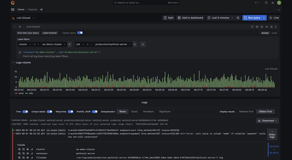
Picture this: you’re in the middle of troubleshooting a critical issue, and time is running out.
You’re staring at a screen full of error logs, trying to figure out where your workflow failed. There’s so much information, but nothing points to the exact cause.
You need to sift through mountains of data to get the right insights to get to the solution. It’s like trying to find a needle in a haystack, with every second counting.
Somehow, you are able to pull off solving the critical issue in time — and thank God for that, otherwise it would’ve cost the organisation you work for, a huge customer.
As a UX designer working on B2B SaaS products, I found myself solving for a similar problem faced by our company’s internal users. My goal was simple: To help internal users identify errors or issues in workflow automation platforms, and to troubleshoot them.
Let me first break down the jargons in the above statement:
“To help internal users identify errors or issues”
- This means giving people working in my company the tools or guidance to find mistakes or problems in their automated tasks.
“in workflow automation platforms”
- These are the tools or software used to set up these automated processes, such as Zapier, Microsoft Power Automate, or Integromat. They let users connect different apps to automatically carry out tasks without needing someone to do them manually.
“and to troubleshoot them”
- Troubleshooting is the process of figuring out what went wrong and fixing it. I wanted to help people understand and solve problems they find in these automated tasks.
Here is another example of how workflow automation tools work: Automated Birthday Reminder Workflow:
- Trigger: Runs monthly using an HR management app (like BambooHR or Gusto) to check for upcoming birthdays.
- Reminder Email: Sends an email through an email marketing tool (like Mailchimp or Outlook) to the team about birthdays next month.
- Card Collection: Uses a collaboration app (like Slack or Microsoft Teams) to notify team members to contribute to a group card or gift.
- Event Creation: Adds a birthday celebration to a shared calendar (like Google Calendar or Outlook Calendar).
- Follow-Up Reminder: Sends a reminder a week before using a task management tool (like Trello or Asana) to finalize details.
But the design problem I was trying to solve was far from simple. I was trying to help internal users identify errors or issues in the workflow automation platform used by them, and to troubleshoot those errors.
It was very nuanced, technical and complicated. I was trying to look into the following 2 aspects:
- How can I design the actual error message so that it helps users to troubleshoot errors in the automation workflow?
- How can the errors be shown effectively to 4 different type of users, solve different error types in varied contexts?
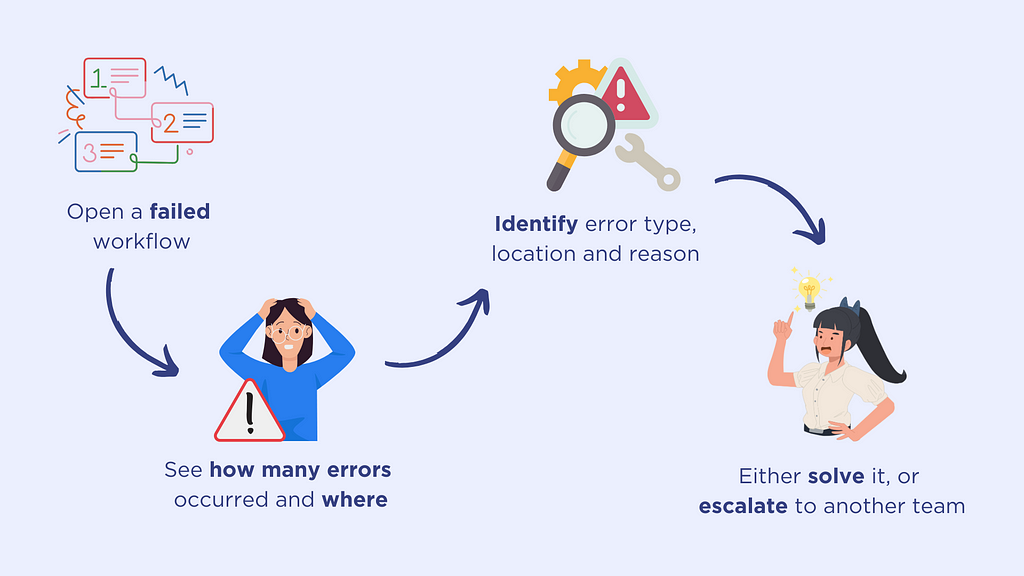
To simplify things, this is how one of the typical journeys would look like for the users:
Open a failed workflow → See how many errors occurred and where → Identify error type, location and reason → Either solve it, or escalate to another team
One of the tough challenges for me was making sure that the error message was designed perfectly so that different users with their own goals can easily understand what to do next.
The other challenge was to make sure that the end-to-end process of debugging and resolving errors was intuitive. But that is not something we will be diving into today.
Here is how I would de-construct the anatomy of an error message:
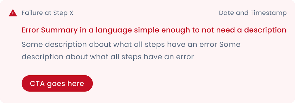
Tip: Instead of blindly using the above anatomy, a better approach would be noting down all possible details the user might need to see on the error message, prioritising them and shortlist ONLY the must-have details on the card.
The best error designs will come from a mix of good product research, stakeholder collaboration, and user feedback.
These are some of the iterations of error message cards I worked on, with varied colour usage, iconography, hierarchy and information:
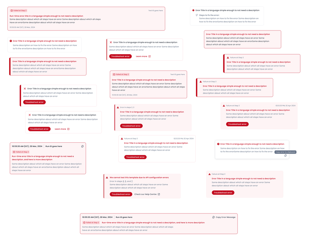
These are my 5 key takeaways from the exercise of helping users troubleshoot errors:
1. Use colours and icons wisely
Everyone knows that in the world of signs and semiotics, red = danger.
But there are many variations of catching the user’s attention to something that has gone wrong. A quick Google search for “error icons” shows 2 different colours and 4 different types of icons being used to denote the same.
But which one works best?
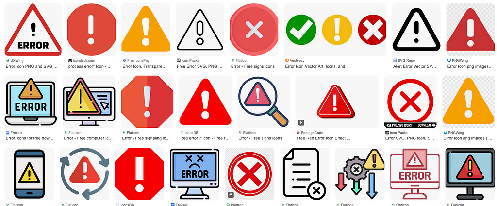
This is where context comes into play, along with considerations for your own design system, if you have one.
If I were to break down how Workato (a workflow automation tool) has done this:

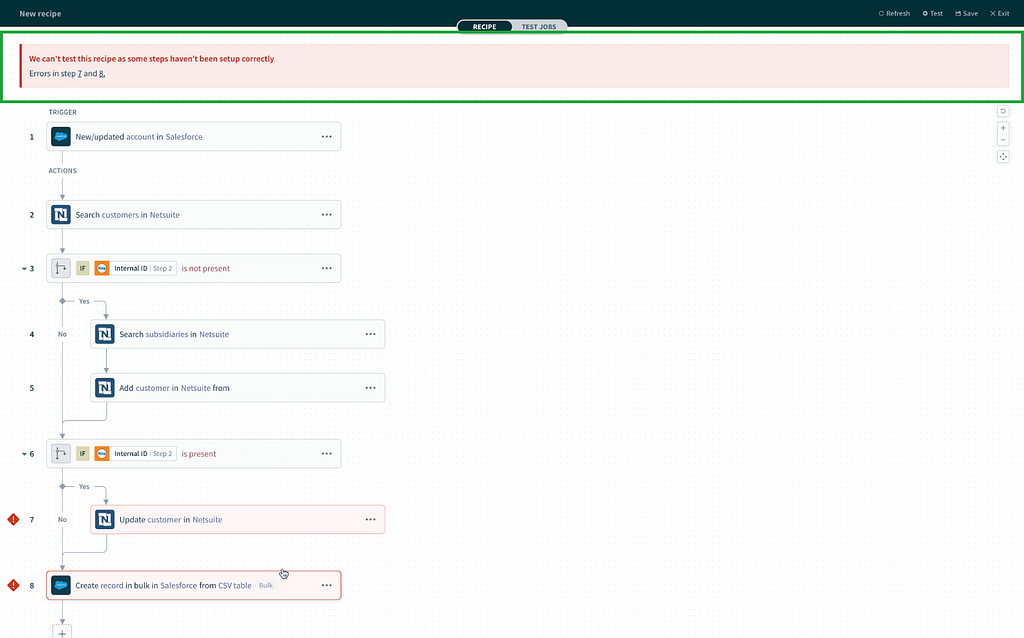
- The topmost error message, which acts as a summary, grabs the initial attention with the translucent red box, a distinct left border and a clear heading stating what has happened.

2. The next order of business is debugging errors at each step. Upon clicking one action of the flow, the user can see the main things they can do to fix the errors in the step.

3. One error icon has been used on the step node, and the same icon has been used in the right panel where the tool suggests how the user can fix the step

4. And the fourth observation is a typical input field level error message “Please complete this required field”.

Looking at the complexity of the product, it is very important to ensure consistency of colour and iconography to reduce the cognitive load of someone who is already doing a complex job.
2. Where should the error message be placed?
The location of the error message depends entirely on how much importance you want to give it and how critical the action is.
Figure this out first:
- How important is the error message?
- What happens if the user somehow misses the error message, skims past it, or ignores it?

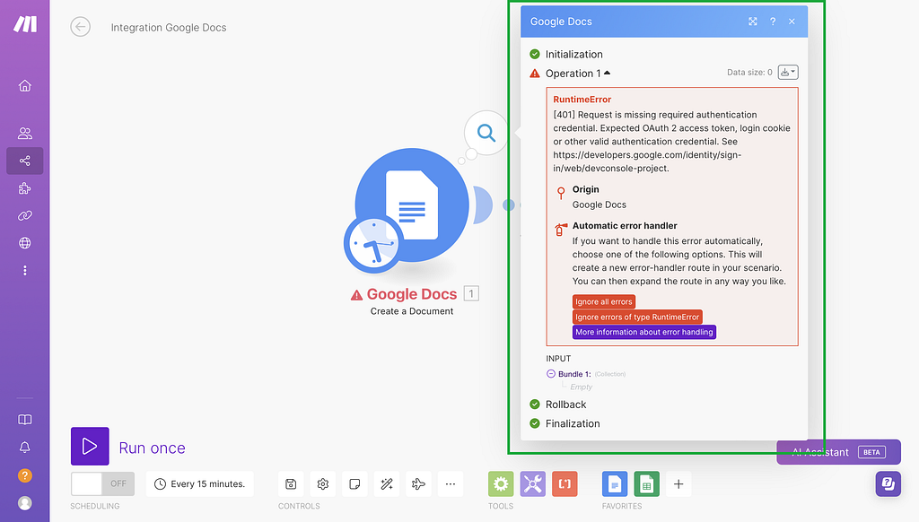
Error messages should be positioned close to where the error occurred.
This proximity helps users quickly identify the problem area without having to search for it. It would also be useful to have inline validation for errors where the user can immediately interact with the elements and see the real-time feedback.

Maintain consistency in error message placement throughout your application. This helps users develop a mental model of where to expect error feedback.
In complex interfaces, consider placing error messages in a dedicated area that’s always visible, such as a persistent sidebar or status bar. This can be particularly useful for ongoing processes or multi-step workflows.
The image below shows how Workato places the error summary at the top:
3. Possible next actions
Design interfaces that minimise the work required to fix errors. Auto-correct minor issues when possible. Auto-fixing or using smart defaults might work for errors in simple forms, but for complex use cases, might not be that “smart” of a choice.
Offer contextual help documentation linked directly from error messages, like Zapier, Workato, or Hubspot do.
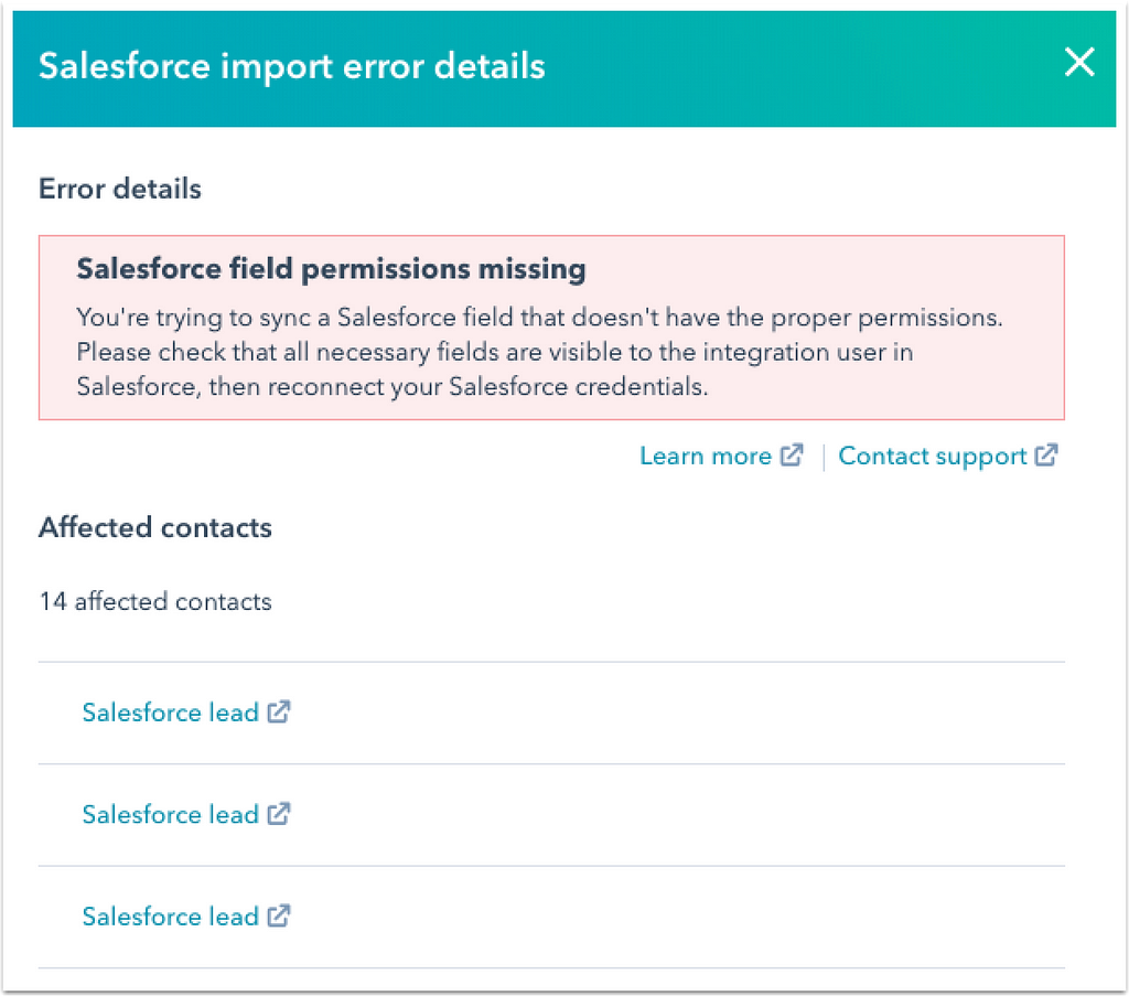
Giving corrective measures or suggestions might make it easier for the users to solve the errors faster than going through the help docs — though having help docs is better than figuring out how to solve the issue on their own.
Workato lists all errors that have occurred at each step in the workflow, and directs the user to the specific configuration in the panel where the error has occurred:

Zapier follows a brilliant approach of not only giving the technical details of the error, but also using human understandable language to help non-techies resolve their issue. They also give a link to the help docs.

Tray.io only shows errors in the form of the input and output, which may not be understood by laymen like you and I, but it might make perfect sense to their target audience — people with knowledge of building integrations and workflows.

4. Making sure the experience scales for different users, for different error types, and in different contexts
This issue was very specific to the problem I was trying to solve.
Imagine this scenario.
- User Type 1 opens Application 1, sees an error, and realises that it is out of their scope to solve it.
- So they reach out to User Type 2, a person with more technical knowledge, and ask them to look into it.
- User Type 2 realises that the root cause of the error is in some configuration in Application 2, not Application 1. So they open Application 2 and test the automation workflow to see what is causing the error there.
In this scenario, it was crucial for me to make sure that the error resolution experience was uniform for Applications 1 and 2, but also that the user is able to differentiate quickly as to whether they are in Application 1 or 2.
To reduce the cognitive load on the user when they are trying to figure out which app they are in, I used iconography and UX copy to make sure that the difference was known. But these are more subtle ways of showing the difference.
A more direct way could be having one visual differentiator between both applications to make sure the user does not have to spend a lot of conscious effort in identifying where they are.


5. Ensure that the experience is accessible
When I was designing for this experience, I was not educated enough about how to design for accessibility. But if I could go back and rework on this, here are some of the things I would consider:
Screen Reader Compatibility
- Test your interface with popular screen readers to ensure content is properly announced and navigable.
- Verify that all interactive elements have appropriate ARIA labels and roles.
- Check that dynamic content updates are announced to screen reader users.
Keyboard Navigation
- Ensure all functionality is accessible via keyboard alone, without requiring a mouse.
- Verify logical tab order through the interface.
- Test that focus indicators are visible and follow a logical path.
Don’t rely on colour alone to convey information — use additional visual cues. This was something I ensured to follow in the designs, as mentioned above, with the use of colours, UX copy, as well as icons.
To sum up…
- Use colours and icons wisely
- Identify where the error message should be placed, and why
- Suggest the next possible actions to the user to help them solve the errors
- Making sure the experience scales for different users, for different error types, and in different contexts
- Ensure that the experience is accessible
References:
- UX Design Practices for Error Screens and Messages
- Error-Message Guidelines — Nielsen Norman Group
- Error Messages Designing and UX 101 — Usersnap Blog
- Designing Better Error Messages UX — Smashing Magazine
- 7 Mistakes to Avoid When Designing the User Experience for Your …
- How to Design User-Friendly Error Messages?
A guide to designing errors for workflow automation platforms was originally published in UX Collective on Medium, where people are continuing the conversation by highlighting and responding to this story.
